- SolutionsDesign
- TechnologiesAdobe Photoshop
- Country United States
Challenge
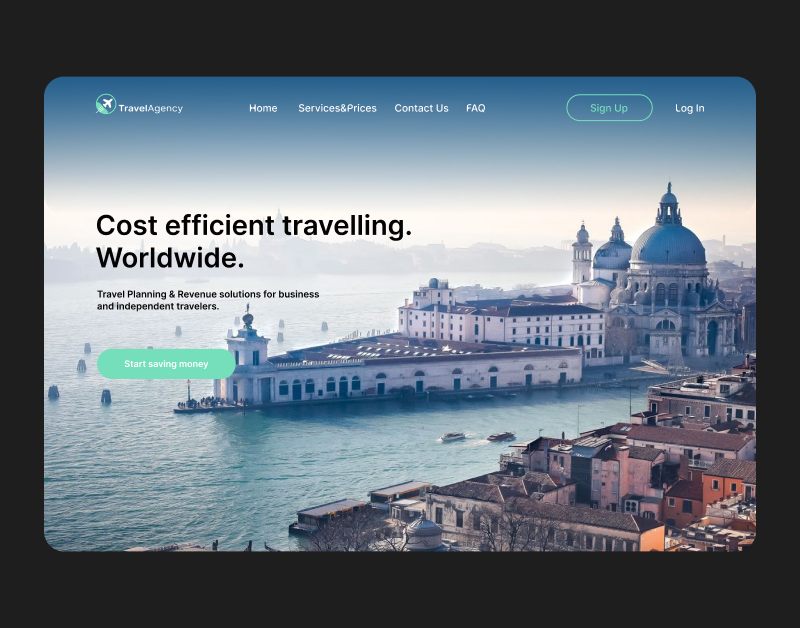
QArea was approached by a US-based travel booking company to develop a design concept for a web-based application that provides easy trip booking for corporate and individual travelers. Having reviewed our portfolio of related travel agency UI design projects, the customer found exactly what they were looking for: a product mindset demonstrated by numerous completed design products plus the demonstration of our constantly improving design skill set.
With the help of the website, users can book flights and hotel rooms for a one-time trip using a variety of filters, or choose a subscription plan to enjoy lower rates on bookings all year round. Since the service is aimed primarily at business travelers (although there are opportunities for leisure tourists as well), the job of the design team was to create a website that conveyed security and ease of use. From the UX standpoint, it was important to ensure the shortest possible customer journey from opening the website to finishing the booking and to make the whole process accessible and enjoyable even for first-time customers.
By the time the client approached us to design the travel site UX and overall look, they already had an existing version of the website that was slightly outdated and no longer met the existing design standards. At the same time, the client and the website already had a loyal audience of customers. This is why one of our key objectives for this project was to create a modern-looking, functional website that still had the recognizable features of the original site.
As it’s often the case with startup-level companies, time was of the essence on this project. Our team had to complete the whole project, from the concept to the implementation stages, within one month. To make this happen, we had to thoroughly plan the process from start to finish and make every hour count.
Project Duration
1 month
Team Composition
Designers – 2
Solutions
We started out by conducting an all-encompassing research of the main competitors in the market to better understand:
- The target audience of the site
- What users were looking for in a travel agency app design
- How different business models were implemented on the websites
- Which design elements were essential for the updated version of the site
- How the updated client’s website could stand out from the rest
Then we got to interview a few of the prospective users of the product to see which features of the site mattered to them the most and which ones they considered to be a dealbreaker when deciding whether or not to use a new service. Subsequently, the results of our research and customer interviews influenced many of the decisions made by our design team, including the navigation logic of the website and the choice of visual elements. We also had to develop a user flow to help us achieve perfect consistency with the backend and frontend parts of the service.
The project implementation took the team about 3 weeks and included the following phases: UX logic development, wireframing, design of the pages, style and color palette approval from the client side, etc. Then, it was followed by a week of minor edits and improvements.
Our primary responsibility was to create the application design and the personal user profile UX. We had to make it intuitive and easy to use, which would help users quickly find the necessary flight or accommodations. The concept of the personal user profile played a decisive role while we were working on the overall UX logic of the travel app design, as it was going to be one of the most frequently visited pages of the site.
One of the key design elements on the home page we used was a parallax effect, which we implemented with the help of a motion designer. This was one of the cutting-edge design technologies while we were developing the look of the website and something we had a lot of experience with. In the end, the parallax effect turned out to be one of the most eye-catching details on the page. In addition to that, we seamlessly incorporated the existing logo and illustrations provided by the client, chose lightweight graphics for quick navigation, and picked a combination of light blue and mint green colors to invoke feelings of confidence, security, and effortlessness.
Figma is the key instrument that we applied for the website prototyping. As additional tools, we used Adobe Photoshop and Adobe Illustrator. Since the design was a crucial part of the app development, clear and transparent communication between the design and development teams and the client also played an important role in the successful project implementation.
Ready to start on your development or testing project? We are!
Get in TouchResults
The work on the project was completed within the deadline. After several iterations of minor changes, the design of the website was handed over to the client and implemented into the product. There are plans to collaborate with the client on future design projects, where we will be able to further demonstrate our expertise and vision.
87%
Satisfaction rate
57%
Conversion of mobile app
7%
Bounce rate decrease
We Help With
Your tech partner needs to be well versed in all kinds of software-related services. As the software development process involves different stages and cycles, the most natural solution is to have them all performed by the same team of experts. That’s exactly what our diverse range of services is for.
The choice of technology for your software project is one of the defining factors of its success. Here at QArea, we have hands-on experience with dozens of popular front-end, back-end, and mobile technologies for creating robust software solutions.
In-depth familiarity and practical experience with key technologies are one of the cornerstones of successful software development and QA. But it also takes specific knowledge of the industry to develop a solution that meets the expectations of the stakeholders and propels its owner to success.

Ensure an effective online presence for your business with a corporate site.
Planning the budget for your project? Spend 5 minutes to get an estimate!
Choose a project-based estimate or quickly calculate how much it would cost to hire a dedicated team.
